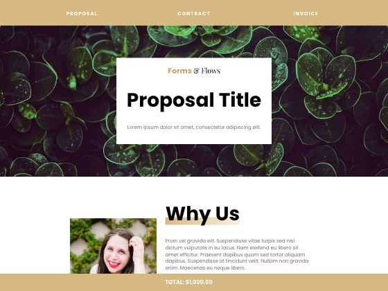

Why we made Fern
Flexible by design. Fern adapts to your brand without losing its structure.
Fern’s layout holds steady while the details change. Swap photos, colors, and type, and the sections still read in the same clear order. The CSS gives you precise control, so the form fits your brand instead of the other way around.
Fern’s palette. Every color is a CSS setting you can change.
Wheat #D8B880
Cream #F8F0D8
Blush #F8D8B0
Mist #F2F2F2
Plum #201020
Inside the form
What’s in Fern
Fern arrives as a complete proposal layout. Use it as it is, or adjust every section to fit your brand.

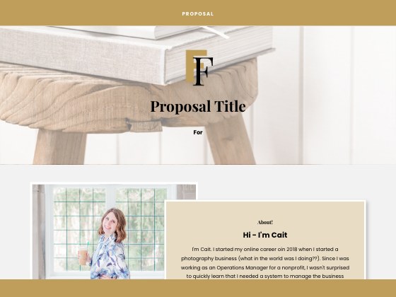
- 5.3% | left | Customizable header | Your own background image, logo, text, and top bar color.
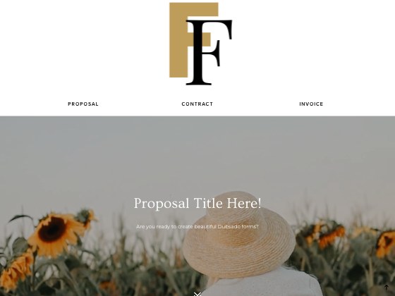
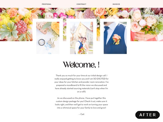
- 14.7% | right | Welcome area | Overlapping elements and a spotlight image that set the tone.
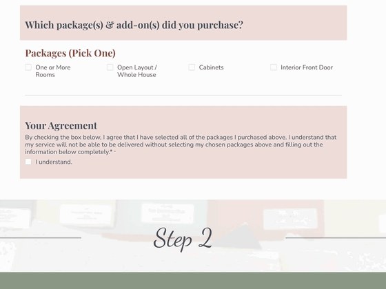
- 38.6% | left | Package and add-on sections | Multiple options in one uniform style, simple to update.
- 74.5% | left | Client details section | Gathers the key client information in one clear place.
- 96.7% | right | Customizable footer | Swap the images in the scrolling gallery to finish on brand.
The showcase
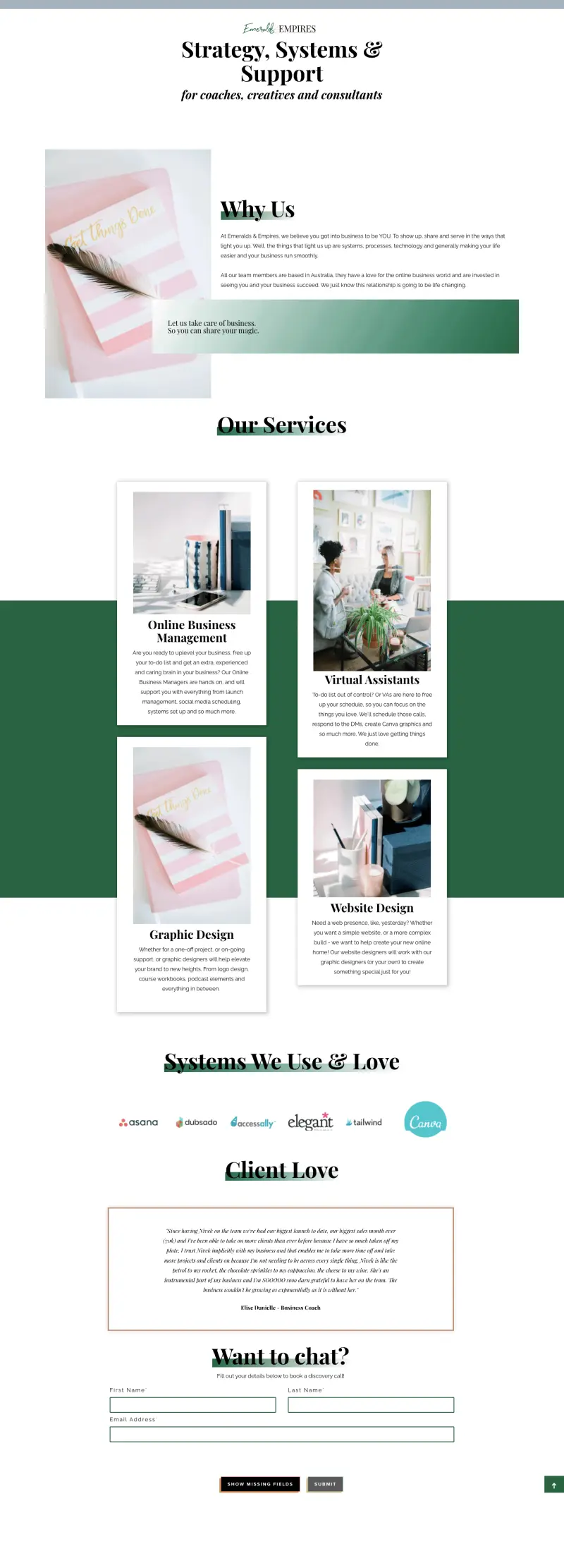
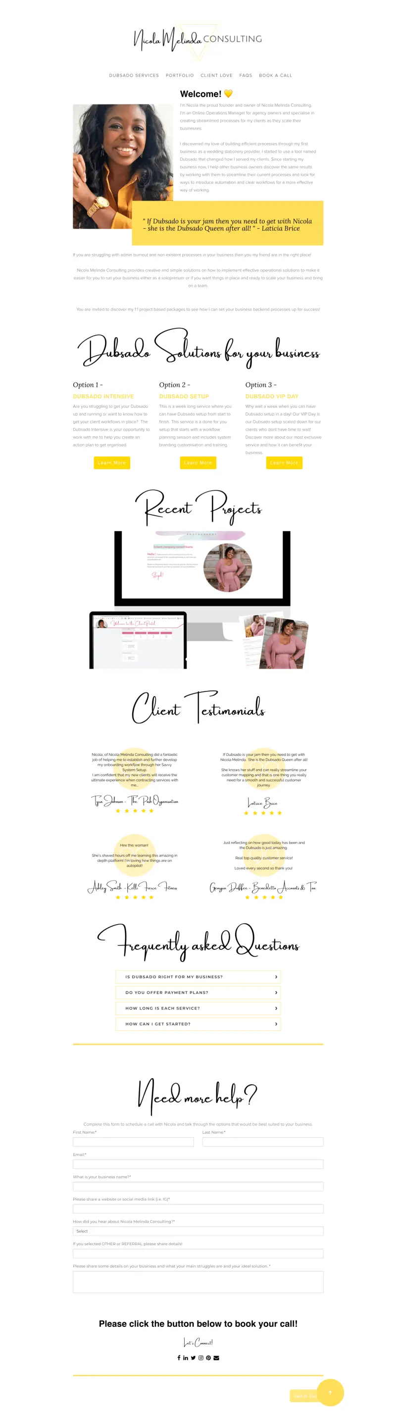
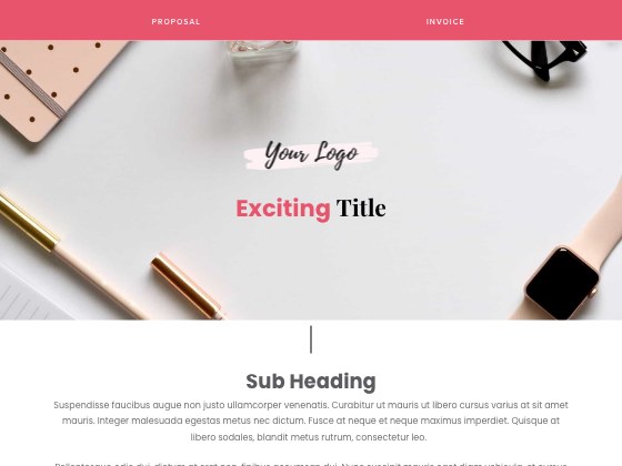
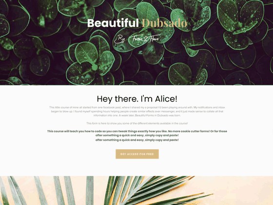
Fern in real client experiences, customized by the businesses that use it.